Feature creep

In the ‘60s, the U.S. Army started to work on a carrier that would swiftly and safely transport the soldiers to the front line. The first prototypes looked promising but then, the hard part begun.
A conclusion has been made that the machine could also serve as a reconnaissance vehicle. This type requires different qualities so they started to work on further modifications attempting to meet the contradictory requirements. In the meantime, the corps of generals has decided that a new carrier… should be also designed as an anti-tank vehicle.
Consequently, the new vehicle - eventually called M2 Bradley — has been developed within 17 years and consumed 14 million dollars.
The effect?
A carrier unable to carry too many soldiers (the number shrinked from 11 to 6), too conspicious reconnaissance vehicle, and an anti-tank vehicle with the armour lighter than a snow blower.
- complained the captain James Burton who managed the project for a long time. He documented his observations in “The Pentagon Wars” book that served as a basis for HBO feature film with the same name.

What's a feature creep?
That's a perfect example of so-called feature creep (also known as featuritis), a disease of most of the products. Also - or maybe even mainly - the interactive ones. What’s it all about?
It’s a conviction that a product quality increases along with its multifunctionality - resulting in a tendency do add consecutive features. Even though nothing indicates they’re needed.
The problem is that the successive - and often contrived - solutions are not something the user needs (or only the narrow group might like them). At the same time, as the complexity increases, the product gets less intuitive and less useful. The product development results not in an upgrade but a quality decrease.
“Feature creep” victims can be found at every turn. How many features of your TV set have you never used? How many of the pre-installed apps in your phone have you never opened? How many functions might your web browser hide?

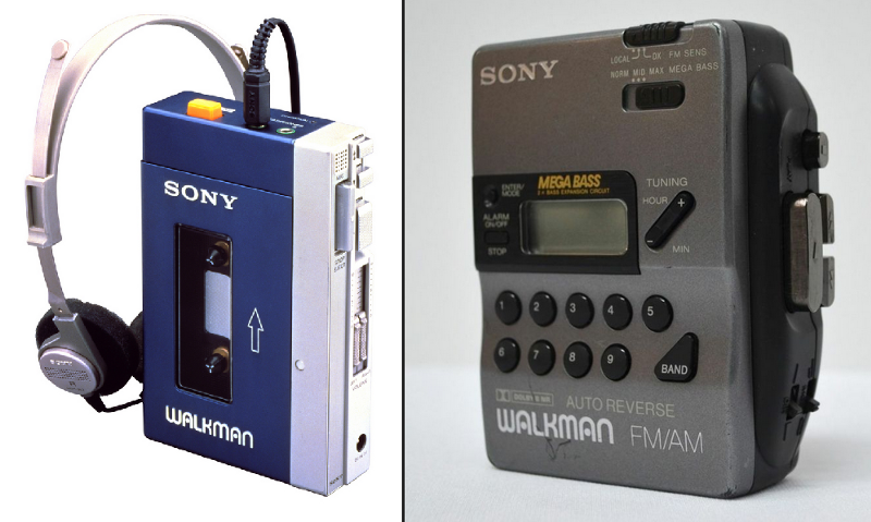
Despite a limited number of features, a first Walkman hit the jackpot. Its next models followed suit of the competition, enhanced with new components - often superfluous from the user's perspective.
Where does it come from?
There are several causing factors and the competition is one of them. If the rival's product has a unique feature, surely someone will come up and suggest its implementation also in your product. After all, you can't give your competition the advantage!
And someone from the competition will say something similar. This is how an arms race begins with the aim of getting a bigger amount of features. An ambition dwarfs a common sense and the genuine needs.
Too literal comprehension of user's opinion might also be a problem. The heavy users, that is, the advanced consumers of the products are generally more prone to suggest the improvements. The improvements that go with a bigger intricacy. These more experienced users don't really mind. All in all, they spend much more time with the system so they'll adopt to the changes. But the rest won't find the new fancy features valuable. They make the product more complicated.
The problem escalates also when we create a new version of our product. Here comes the urgency to show that +1 version will be better than the last one. So how to achieve that in the easiest way? Surely, by showing the list of new features! And what if they aren't really needed? Well, pretty often such a verification isn't possible before we use a product.
Ways to avoid it
Unluckily, featuritis is a natural side effect of the product development and therefore, its complete eradication isn't easy. There are the ways to mitigate the effects, though.
The creation of verification procedures for the new features is key. You have an idea for a product refinement and that's awesome. But firstly, let's check its usability. Bear in mind that the direct queries to the users don't work this way. When asked do they want any given function, the majority will reply with a nod.
It's also worth to control the creation and implementation cost of each feature. In this way, it will be easier to assess its profitability. Such a transparency should also hamper the people who tend to thoughtlessly suggest the successive improvements.
When - at last - the new solutions are put through, it's worth to verify those already implemented and get rid of the non-profitable features. It should help to keep the balance.
All of these rules will come in handy in you want to keep the product in a concise, unforced form - which will be good both for you and the users.
